Most packaging design problems are not design problems at all. They are manufacturing problems that were never caught in time. We review hundreds of artworks every year, and the same pattern repeats: the concept looks excellent on screen, the quotation is approved, and the first printed sample exposes something that would have taken ten minutes to fix at the design stage.
Packaging design is a manufacturing specification with a picture on top. These are the ten pitfalls that most often turn a strong concept into an expensive reprint.

1. Designing a Flat Layout for a Three-Dimensional Pouch
A pouch is not a sheet of paper. The bottom gusset of a stand-up pouch, the corner folds of a flat-bottom bag and the sealed edges of a quad-seal pouch all consume artwork. When a layout is built from the visual impression of a finished bag instead of its real unfolded dimensions, headlines and logos end up folded into a seam. Confirm the pouch type and dimensions first, then design on the true layout.
2. Choosing Colours From a Monitor
Screen colour is additive light; printed colour is ink on film. Wide-gamut neon, strong gradients and very fine tints are the three things that most often disappoint in production. Specify Pantone references for brand colours and state clearly which elements must match exactly and which are allowed to flex.
3. Ignoring Bleed and Safety Margins
Bag making involves material drift and cutting tolerance. Artwork that runs hard to the edge can be trimmed away, and text placed too close to a seal can disappear into the join. Keep a safety margin on all four sides and move mandatory information well inside it.
4. Forgetting How the Substrate Changes the Look
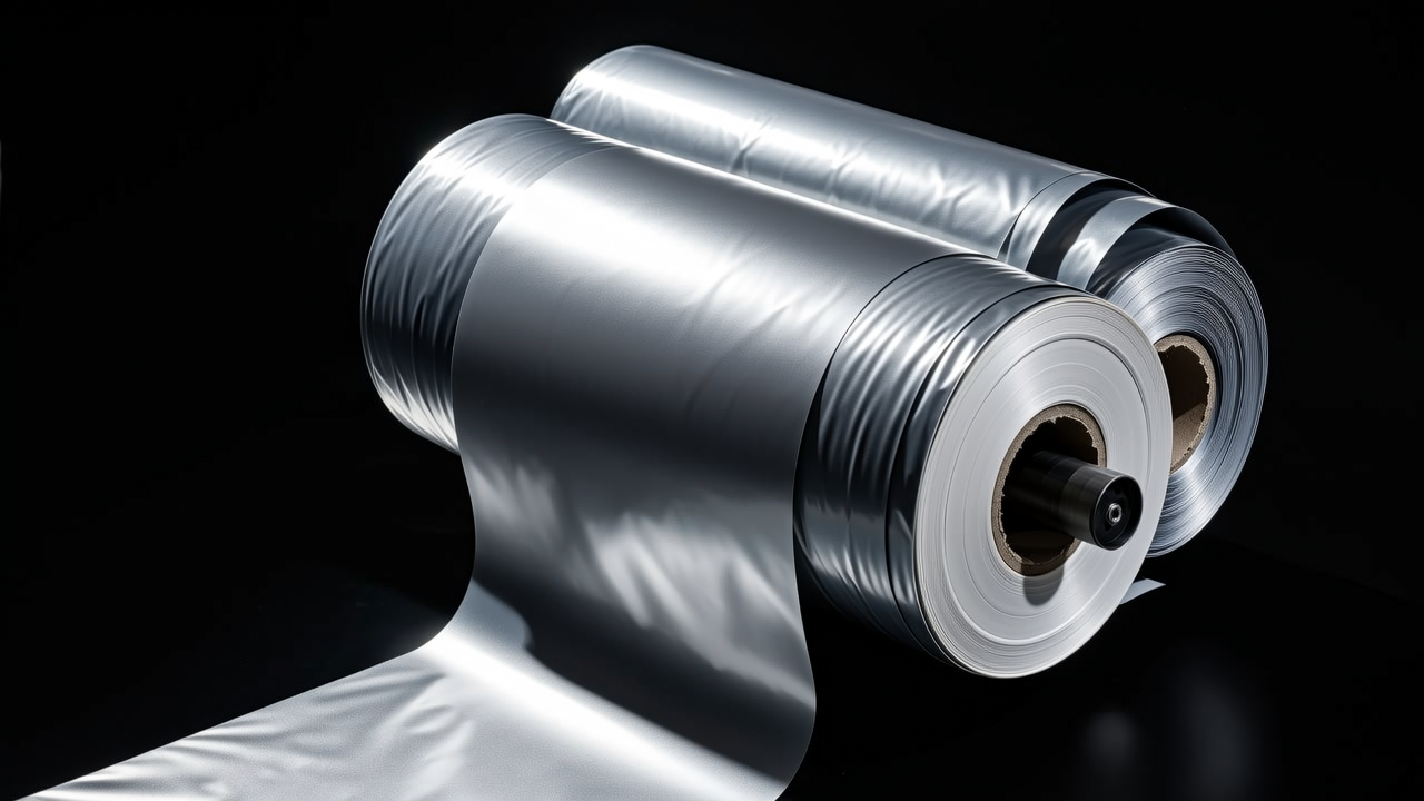
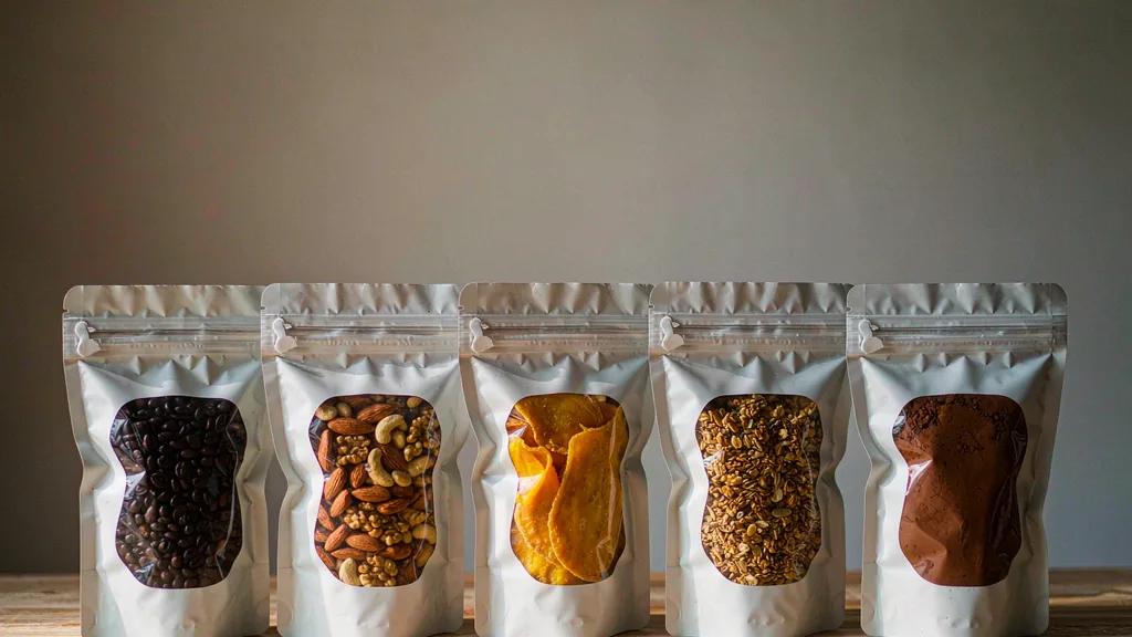
Matt, gloss, metallised and clear-window films all render the same artwork differently. A design approved on a white PDF can look washed out on metallised film or muddy behind a clear window. Approve a physical proof on the intended substrate, not just a digital one.
5. Choosing Gravure Artwork for a Small Run
Gravure printing offers the best consistency at volume, but it requires engraved cylinders and a high minimum order. Digital printing is usually the better answer below a few thousand units because it removes plate cost entirely. Decide the run size before the artwork is finalised rather than after; our product packaging upgrade guide walks through that decision.
6. Leaving Structure and Features Undefined
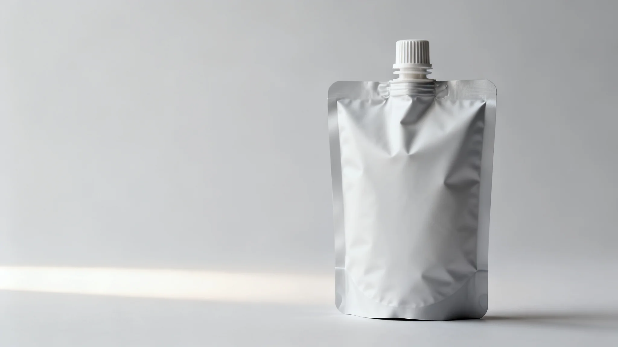
Zipper or no zipper, easy-tear notch or scissors, spout or pour corner: every one of those choices changes the pouch structure, the sealing window and the unit cost. Adding features late usually means rebuilding the structure from scratch. The zipper, easy-tear and spout pouch comparison covers those trade-offs in detail.
7. Ignoring the Filling Line
Automatic form-fill-seal machines, semi-automatic fillers and hand packing all place different demands on roll direction, seal placement and opening position. A design produced without knowing how the product is filled is a design that may not run at all.
8. Treating Shelf Impact as an Afterthought
Brand block, product shot, variant naming and mandatory text need to be zoned deliberately. Discovering that the main visual is too small only after the bags reach the shelf is the most expensive mistake on this list, because the fix then requires new plates and a full reprint.
9. Missing Mandatory Labelling
Food contact packaging carries a defined list of required declarations, from material statements to recycling marks and compliance references; for the European market the EFSA food contact materials framework sets out how material safety and migration are assessed, and CEFLEX publishes the industry design guidelines for recyclable flexible packaging. Walk through that list before the artwork is locked, because a single missing element can invalidate an entire production run.
10. Underestimating the Cost of One More Revision
A revision is never just a file change. Cylinders may need re-engraving, new proofs must be approved, and existing stock can become obsolete. Front-loading rigour into the approval process is always cheaper than fixing it afterwards.
A Simple Order of Decisions
Define the pouch type and substrate first. Then fix the printing method and finishing. Only after that should the visual layout be built. Finish with a manufacturability review covering safety margins, colour references, labelling requirements and filling compatibility.
Getting It Right the First Time
If you would rather not learn these lessons during a full production run, contact our packaging engineers with your artwork and shelf requirements, and we will review it for manufacturability before anything is engraved. You can also explore our flexible packaging range.