Shoppers make most purchase decisions within seconds of seeing a product on a shelf, and in those seconds the first thing their brain registers is not the brand name or the ingredients list — it is the packaging color. Decades of consumer psychology research show that packaging color can instantly trigger emotional associations that shape how people judge a product’s flavor, quality, and even its price. For brands, understanding how packaging color influences buying decisions is one of the cheapest conversion levers available. In this guide, we explain the psychology behind color, the signals each hue sends, and the practical rules you can use to make your packaging work harder at the point of sale.
Why Color Affects Buying Decisions: The Science
The reason packaging color has such power is rooted in how the human brain processes visual information. Color signals travel from the eye to the amygdala — the emotional center of the brain — before they reach the cortex responsible for rational analysis. In plain terms, shoppers have an emotional reaction to a color before they have even consciously thought about the product. This is why first impressions on a crowded shelf are decided almost entirely by color.
A second mechanism is learned association. Through evolution and culture, humans have developed near-instinctive color reflexes: red evokes fire, danger, and excitement; blue evokes water and sky, bringing calm and trust; green evokes plants and freshness, signaling health and nature. When a packaging color matches the product category, the match feels effortless and right. When it conflicts with category expectations, shoppers experience a vague sense of discomfort that they cannot always explain. That subconscious match — or mismatch — is the real engine behind color-driven conversion differences.
What Each Color Communicates: A Quick Reference
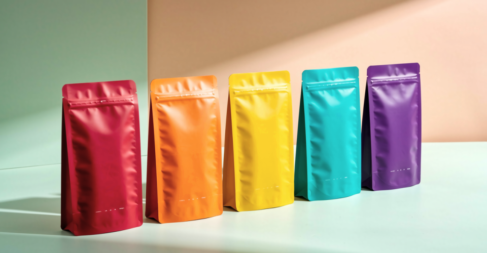
Color meanings vary across cultures, but in mainstream consumer markets several core signals are remarkably stable. Red communicates passion, appetite, and urgency; it is a top choice for food and beverage packaging and for promotions, because it creates a sense of excitement. Orange is warmer and friendlier than red, making it popular for snacks and children’s products. Yellow suggests optimism and grabs attention, but large areas of yellow can feel cheap, so it works best as an accent. Green signals nature, health, and sustainability — the default for organic food, tea, and better-for-you snacks. Blue stands for calm, professionalism, and trust, which is why frozen food and seafood brands favor it. Purple signals premium and distinctive positioning, while black and gold combinations convey luxury and are common in premium chocolate and gift packaging. White represents purity and simplicity, and it dominates dairy and personal care shelves.
One important caveat: color psychology provides a starting point, not a finish line. The same green that reads as “natural” on an organic vegetable pouch can read as confusing on a technology product. The signal always has to be interpreted together with the product category, the target audience, and the sales channel.
How Packaging Color Works in Different Categories
Look at the leading brands in any mature category and you will see an unspoken color agreement. In beverages, colas use red, sports drinks use cool blues and greens, and juices use warm oranges and yellows — color has become a category code. Snack and confectionery brands favor highly saturated reds, yellows, and oranges because high saturation stimulates appetite and impulse buying. Health food and meal replacement brands lean on muted greens and beiges to signal a clean ingredient list. Baby and mother-and-baby products use soft pinks, yellows, and whites that lower visual stimulation and communicate gentleness. Frozen foods consistently use cool blue-white palettes because cold colors are cognitively linked to low-temperature freshness.
These patterns follow one logic: consumers decode color through their category experience. Colors that meet expectations lower the effort of decision-making; colors that contradict expectations add friction. Unless you have a very strong reason for differentiation, using color “against the grain” in a mature category is risky — you may win attention, but shoppers may not understand what you are selling. If you are planning a redesign, our guide to when and how to upgrade your product packaging walks through the full process, and our article on elevating small brand packaging shows how smaller players can compete on shelf presence without a huge budget.
Five Practical Rules for Higher Conversion
Understanding the theory is one thing; applying it is another. Here are five practical rules we use when advising brands on packaging color:
Rule one: set the category signal first, then add brand personality. Make sure your color fits category expectations before you try to differentiate with hue shifts or secondary colors. Rule two: use contrast to create shelf pop. On shelves crowded with similar products, choosing a palette that contrasts with the dominant competitor color makes your pack visible from several meters away — the cheapest form of advertising you can buy. Rule three: limit your palette to three colors or fewer. A main color, a supporting color, and an accent color are enough; every extra color dilutes the memory point. Rule four: design for the channel. Online main images and physical shelves have very different lighting conditions; dark colors that look elegant in person can turn into an unreadable black rectangle on a phone screen, so optimize brightness for your primary channel. Rule five: test instead of guessing. Run small-batch A/B tests comparing conversion data across color variants and let the numbers decide.
Summary and Recommendations
Packaging color is the first point of contact between a product and a shopper, and it influences buying decisions through fast emotional reactions and category associations. The key to using it well is to respect category codes, limit your palette, adapt to your channel, and validate with real sales data. Color is the hardest-working employee on your packaging — it sells for you every day, on every shelf, without a salary. If you are considering a color refresh or a full packaging redesign, contact OMOpack — our design team combines category data with color psychology to build packaging that converts. Visit OMOpack.com for more packaging knowledge and industry insights.